This graphic is interactive, click here.
(for Internet Explorer users, version 9 or above is required)
Investors often ask us a variety of common questions about the market for GSA leases. They ask:
“How many large leases are there?”
“How many have long terms?”
“If I’m investing outside of Washington, DC, what’s my opportunity?”
And, of course, they ask many more questions too. We’d like to think we have answers to them all (call and test us!).
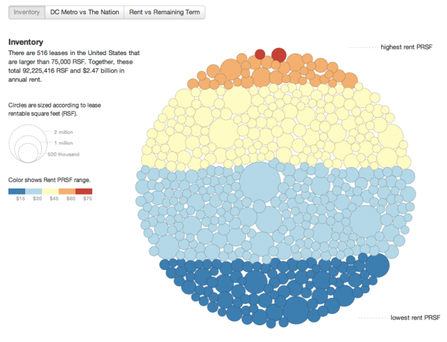
In response, we created this graphic which illustrates GSA’s national inventory of leases 75,000 rentable square feet (RSF) and larger. Each lease is represented as a circle, or “bubble”, which is sized based upon the lease RSF and color coded according to its rent per RSF. We illustrate the inventory various ways and the graphic is largely self-explanatory but here are a few quick observations:
- There are only 516 leases nationwide that are 75,000 RSF or larger. This is less than 6% of all GSA leases. Yet, these larger leases total more than 92 million RSF, nearly half of the entire GSA leased inventory.
- When it comes to big leases, there are almost as many in the Washington, DC area as there are in the reminder of the United States. It’s no wonder that two of the three largest government property investors in the U.S. own almost no government-leased buildings outside of the National Capital Region.
- Rents are generally higher in the Washington, DC area too, due to the fact that the region is one of the nation’s most expensive office markets, and due to the low proportion of industrial properties.
- Long term (> 10 years) leases are fairly rare and, as we’ve observed in a different article, their numbers appear to be declining. If you want to buy properties with leases larger than 75,000 RSF and terms of 10 years or more, you are looking at a finite list of just 66 leases (some of which are in multi-tenant buildings).
Those of you who are long-time readers of our blog may recognize this “bubble graph”. It is a riff on the excellent federal budget graph created earlier this year by Shan Carter of the New York Times. We profiled it here.
Notes: Our graphic is based upon March 2012 inventory data presented by GSA. It does not include leases that are awarded but not yet commenced. Because there is often a lag between lease commencement and the appearance of that lease in GSA’s data, some additional leases may be missing as well.

