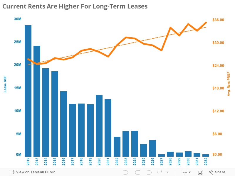
A while back we studied the national lease expirations trend and we were interested to see how the volume of expirations tends to “step” down about every five years. The big step occurs after 10 years of remaining term because leases longer than that are typically reserved for build-to-suits, especially that class of leases with terms longer than 15 years. Looking again at that chart we wondered if there was any difference in rents for leases of different length. I think most people’s instincts would be to guess that rents tend to be higher for short-term leases than long-term ones. But, as you can see above, the data shows the opposite result. Before jumping to any quick conclusions, hold on. As it turns out, there are some pretty simple explanations for why this occurs. We find them interesting, nonetheless.
First, some background on our methodology: We utilized data from GSA’s leased inventory, yet we eliminated all leases smaller than 3,000 RSF. The reason is that these accommodate a preponderance of atypical uses – generally parking leases and airport-related TSA leases. Though the overall impact of these on our aggregate expirations is fairly small, the rents are a mixed-bag. We wanted to focus on the meatier, more traditional inventory of leases 3,000 RSF and larger. Our graph shows the RSF of those leases expiring nationally in any given year. The longest running leases in GSA’s inventory extend 20 years, so our graph ends at 2032.
The rent trend illustrates the current rent paid for leases expiring in each year. If we had it, we would have used the initial base rent for each lease instead of the current rent but, well, that would have taken a lot more work and these figures are close enough to prove our point. The important thing to remember is that the trend shows the rent that is currently being paid for leases expiring over the next 20 years.
So now the reasons why rents skew higher for longer term leases:
1. Almost all of the longest leases are build-to-suits. Several of these are FBI build-to-suits. Though all build-to-suits tend to run significantly more expensive than existing buildings, the FBI prototype is a technical building with a large site to accommodate security standoff distances and, therefore, it is even pricier.
2. There are remarkably few long-term warehouse leases to pull the average rent downward. Many of the longest warehouse leases in the federal inventory have historically been signed by the National Archives and Records Administration (NARA) using its delegated authority; therefore, these leases aren’t recorded in the GSA’s inventory (which is what we are studying here).
3. The first two observations explain the data bias that leads to higher rents for longer term leases. However, the fundamental reason they skew higher is that most GSA rents are flat. It is a quirk of GSA’s leasing process that flat rents are most often executed. In fact, GSA’s Form 1364 (its pricing offer form) is formatted with a flat rent offer in mind. Since private-sector leases tend to escalate, the equivalent flat GSA rent is typically higher in the initial year (and lower in the final year). The longer the length of the lease, the higher that “equalized” GSA rent becomes.
Now, as there are many GSA Realty Specialists who read this blog, I am not suggesting that there is any economic benefit to signing short-term leases. As relates to build-to-suits, short-term leases aren’t feasible and, for the rest of the inventory, long-term leases will generally generate lower costs over the entire contract and they allow for TI and capital costs to be spread out. More importantly, they lock in the rental rate providing a hedge against market rents which – in the long run – almost universally increase.
On that last point, we note that the graph’s dotted trend line illustrates the relationship between current rent and lease term. The slope of that line is equivalent to a 1.6% annual increase, significantly less than the average rate of CPI inflation over the past 20 years (2.5%).
To explore the trends for yourself, move your mouse over the graph above to see the data that’s behind it.