When faced with thousands of pages of budget submissions and hundreds of megabytes of data, there is nothing so wonderful as a good infographic to make sense of it all. We’ve searched the web to find the best sites and included them here. Continue to check back because as we find others we’ll add them to this post.
Washington Post
 Of course we had to include our hometown newspaper. The attached infographic shows how spending has changed by presidential administration over the past 30 years. Its interesting to note the inexorable climb of Social Security and Medicare entitlement costs.
Click here to interact with this infographic.
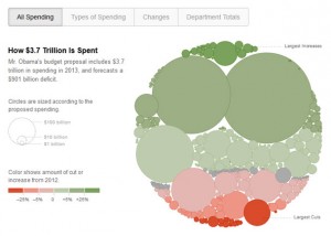
New York Times
 The venerable New York Times has long been the infographic king of the journalism industry. Their analysis underscores the frightening fact that the much of our federal budget is devoted to servicing entitlements and interest on the public debt. Discretionary spending is less than 1/3 of the federal budget and, despite cuts, it cannot counterbalance growth in entitlement and interest spending.
Click here to interact with this infographic.
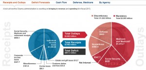
Wall Street Journal
 The Wall Street Journal’s analysis illustrates the budget five ways: receipts & outlays, deficit forecasts, cash flow, Defense and Medicare, and discretionary spending by agency. This last graph highlights an issue that we have often discussed with federal landlords: Department of Defense discretionary spending is greater than all other cabinet level departments combined. This is why DoD is so critical to certain local economies – especially Northern Virginia. A legion of federal contractors are sustained by defense spending.
Click here to interact with this infographic.
